Our design
Our design portraits our personality as a pioneer and has its fundaments in our history and in the Nordic aesthetics. Everyone communicating as Schibsted or creating products or services with Schibsted as a sender shall follow the guidelines below. On this page you also find links to all our brand assets. There is a more complete design system for Schibsted designers in Figma.
Shortcut to our assets
Quick guide to six important rules
These rules are the most important to get right. Read more about each below.
Our logotype is black
The main colour of our logotype is black. If the background is dark it can also be displayed in white. No other colours are allowed.
We are blue
Our main colour is blue. We have a range of blues in our main palette, the blue 90 and 60 are the ones we should use the most.
A unique font
Schibsted Grotesk is a font created especially for us. It should be used on all platforms and products where it's possible.
Text in black or dark blue
We use black or blue 100 for text - whether it's body text or headlines. On dark backgrounds we also use white. Our red is only used as a contrast to highlight separate words or items.
Remember to use photos
We have a great set of illustrations – their purpose is to lighten up our impression. But if you can, use photos as your first option. It will convey a more authentic feeling.
Who we are and how we speak
If you are communicating on behalf of Schibsted you should also look into our <a href="https://schibstedmedia.com/about/content-style-guide/">content style guide. </a>
Logotype and symbol
Our logotype is based on a friendly and geometric sans-serif font. It has slightly rounded corners to achieve a warm and humanistic tonality. The pattern integrated within the first letter S symbolises the unifying force of Schibsted, that brings brands and people together. The capital S in our logotype is also our symbol. The symbol should mainly be used in situations when the Schibsted context is already clear.
Read more
Schibsted Grotesk – a unique typeface
Schibsted Grotesk is a typephase created for Schibsted. It’s an extensive typographic system covering over 220 languages through 496 glyphs and twelve styles. Taking visual cues from our history of printed media as well as our pioneering digital nature, Schibsted Grotesk was designed to become an active tool that empowers brand ambassadors and inspire internal and external audiences.
Read more
Colours
Schibsted's colour palette comprises a wide colour kit that covers multiple needs for communication and broad technical needs. There is a main palette for most common needs, a tonal palette of blues and greys and a set of semantic colours. Schibsted’s main colour is blue, we also have a red to serve as a warm contrast.
Read more
Gradients
An important part of our graphic toolkit is the gradient kit. These gradients brings spatiality to layouts and can be used as backgrounds and vivid animations. Conceptually, it alludes to cloud computing and futurity and are inspired by the pattern in the S in our logotype.
Read more
The Schibsted pattern
The shapes in the capital S in the Schibsted logo – the unifying force – have also got a life of their own. In the Schibsted pattern the pillars in that force is combined in a flow to create a pattern that becomes a subtle symbol of our brand. The Schibsted pattern is at is best when animated on screens, but can also be used as still patterns in printed products or in office spaces.
Read more
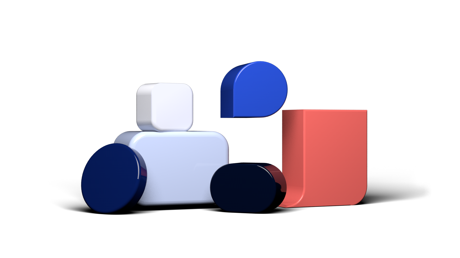
Radius and shapes
Inspired by the dot and pill shapes found in the S in the Schibsted logotype, we tuned up the presence of rounded corners in objects and surfaces in our visual language. There are radius principle and six shapes at play in our system.
Read more
Descriptors, logo combinations and family endorser
The logotype is often combined with descriptors, like names of divisions or departments within Schibsted. We have some rules on how we set these up and how we present the Schibsted logo together with family brands' logotypes.
Read more
Avatars
Avatars can be used as app icons and senders. They cover three use cases in small, medium and large sizes.
Read moreGrid
Whenever starting a project, consider working with a flexible grid that performs well across different digital devices.
Read more
Buttons, input and labels
Buttons are the bread and butter of your interactions. The basic button kit will give you a kick-start for multiple tap sizes, states and different use cases.
Read more
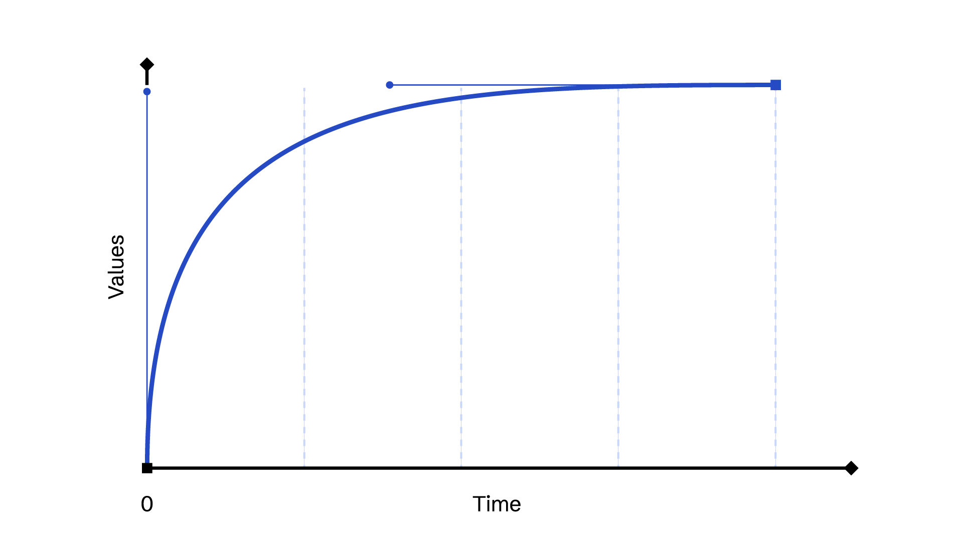
Motions
Built around the concept of unifying forces, Schibsted uses rotation as a key distinctive element in its motion visual language. Learn more about the ideas to keep in mind to approach motion in the new Schibsted system.
Read more
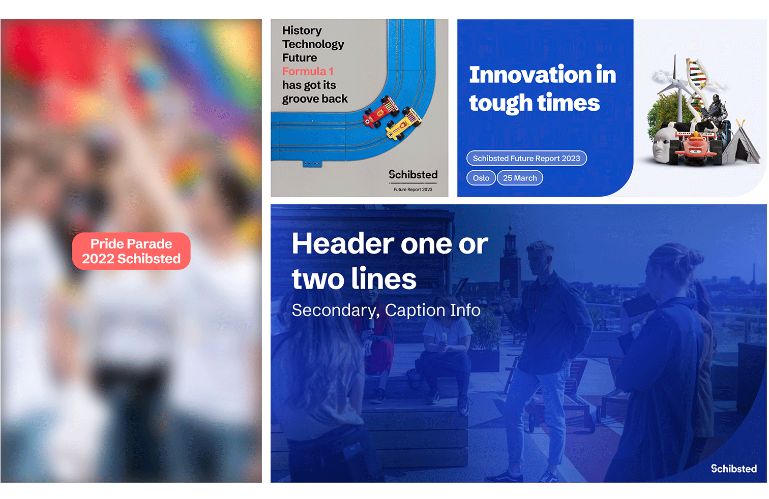
Templates
We have several useful templates that everyone communicating the Schibsted brand should use, like presentation templates, descriptors and mail signature.
Read more
Brand images
The Schibsted brand images is a selection of pictures taken to present Schibsted people, offices and users. There are also some photos illustrating specific themes like tech and Nordic environments. These photos are only to be used in Schibsted contexts.
Read more
Icons
In Schibsted we use the Google material icons. There is a wide selection to chose between.
Read moreSchibsted brand illustrations
In Schibsted we have our own specific illustrations. There is a wide selection to chose from, in different sizes. Remember that these illustrations are complements - always consider if you can use a real image, they represent a more authentic expression.
Read more


